A common misconception about ‘clean’ website design is that it has to embrace minimalism, including barely any elements for the sake of good user experience (UX). The truth is clean website design isn’t solely linked to how much is on the page. In fact, if done right, you can include a lot of information on a single page without overwhelming your user.
When we talk about clean web design, what we mean is a design that exhibits precision, consistency, and beauty all at once. It’s easy for your user to navigate, makes sense to the eye, and doesn’t overwhelm them as soon as the page loads.
So how do you get from a blank page to a clean build? Easy—by following the five principles we’re outlining below.
1. Simplicity

The core of a clean website design lies in simplicity. While cluttering your page with many features and elements can be tempting, your best bet is to keep each page as straightforward as possible.
Every time you create a page, step into your user’s shoes. Consider what they need from the page and deliver on that promise as seamlessly as you can. Think of this in terms of friction. You’re trying to advance your customer further down the conversion funnel, but the more obstacles or distracting features in their way, the harder it is for them to move smoothly to a conversion.
Don’t get us wrong, you can still have a unique and inspiring design while shooting for simplicity. The key lies in the subtle details; drop shadowing, distinct font families, and texture overlays are all your friends here.
2. Consistency
Next up is consistency. Every page on your website should look and feel like it belongs with the others, making your user’s journey around your site a smooth one. The key to this is choosing your design elements early, then incorporating them consistently across all site pages.
Headings, font size, colour palette, button style, photo treatments; sit down and clearly decide what each of these elements will look like before you hit the Publish button. Once implemented, you’ll find your site has a holistic and well-rounded feel to it, making navigating it that much simpler for your user.
3. Choose a Grid
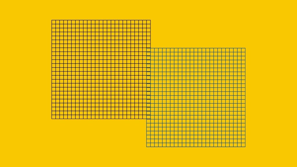
Third on our list is choosing a grid, and while this is an integral aspect of clean website design, we find it is often overlooked by novice site builders. In fact, in the battle for consistency, a grid may be your greatest weapon.
Think of a grid like an invisible set of guides overlaying each website page. It’s your site’s skeleton. You use these guides to align your elements, creating a logical and well-spaced page design that is pleasing to the eye. There are a huge variety of different grid layouts to choose from, including:
- The 960 Grid
- The F-Layout
- Column Grids
You can even create a custom grid to suit your site’s needs. The key is to implement this grid across all pages, then use it as your guide when adding elements to each page. In comparison to the cluttered websites littering Google’s SERPs, your users will breathe a sigh of relief as they navigate to your well-organised site.
4. User-Centric Build
Speaking of our users, there’s one thing that many site builders forget as they get lost in a sea of potential plug-ins: the website is ultimately for the user, not the business. New customers know nothing about your business, and your goal is to educate them while keeping them interested in what you have to offer.
Therefore, you must build a website that caters to your user’s needs, not yours. From healthcare website design to e-commerce development, there is one question that always ensures you’re choosing the right elements: will adding this help my user? If the answer is no, then don’t add it. If the element would be more useful to your user elsewhere, transition it to that space.
5. Give Them a Map
A core element of a clean design and user-centric build is simple navigation. Even if your user has never visited your website before, it should be easy for them to find what they are looking for. How on Earth do you accomplish something like that?
Well, you give them a map. Not a physical map; the key is to create an intuitive sitemap that users can logically follow to their destination. Luckily, you can bet on your users being experienced with how a website should operate, so you can use their existing knowledge to forge a new landscape.
Even if your website has some custom pages or elements, including them amongst typical pages like “Home”, “About, and “Contact” as well as openly linking to them will guide your user with ease. They know what to expect, and you can use that to your advantage.
Finding the right balance can be tricky, but with the right team on your side, you can have a clean website design
We’re the resident experts on all digital solutions in NZ, offering our customers access to a creative, innovative, and experience team of web designers.
If you’re an up-and-coming business looking to get on the map, or even a well-established business with expansion on the brain, talk to the team at Future Lab to launch a stunning new site.