Web Design Case Study: MS Auckland
Sector Business, Administrative & Support Services Healthcare & Community Services Visit live site
Services

Challenge
MS Auckland wanted a website design that showcases its various services and presents relevant information about a sensitive health condition with much warmth. The website had to reflect the right sensibility as well as host detailed information to help users reach out to healthcare professionals more easily. A web design that is pleasant, information rich along with the right aesthetic elements were some of our considerations. Ultimately, we wanted to position the company appropriately in the digital space.
Outcome
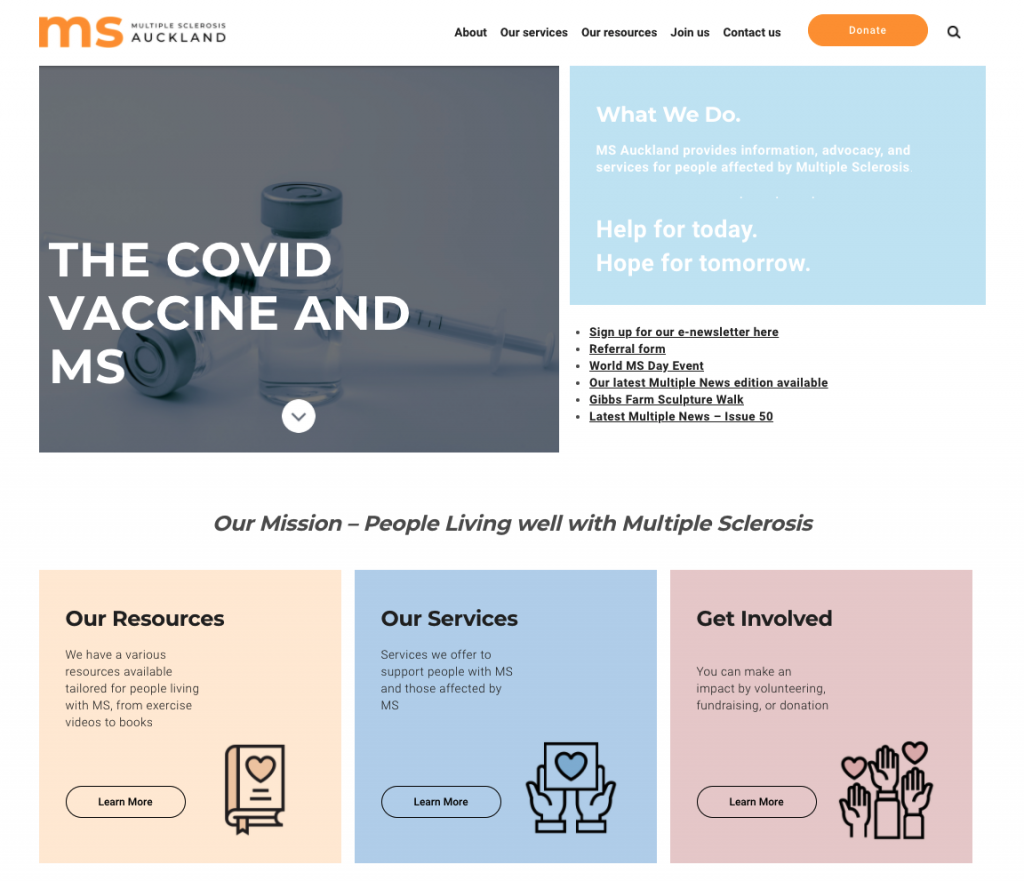
The design dons a warm palette of pastel colours, and together with bold fonts, it creates a compelling user experience. The layout is designed to help users process exhaustive information about the organisation’s services and helpful resources–without feeling overwhelmed. The illustrations we designed echo a vibe of genuine support and care. All in all, the website is packaged to bring out the essence of the organisation in a colourful and bold way, and thereby reach out to thousands of users who are searching for such information online.
Creating Awareness of Multiple Sclerosis
One of the biggest challenges we had was to collate a wide array of information across different categories and make it look orderly and presentable. Moreover, we had to project a warm vibe in keeping with the sensitive nature of the health condition. We designed illustrations that very much express the emotive aspects to gel with the content, helping the user process extensive information with ease. What’s more? We also enabled a display of new stories readily accessible on the home page.
Web Design NZ Case Study: MS Auckland
A Clutter-free Page Layout
The warmness extends to the other pages as well including our services and our resources web pages. We added another colour dimension–a pop of bright orange–to bring alive rather monotonous and comprehensive health information. Furthermore, we used multiple blocks of different styles to describe every type of support provided by the organisation.
We also added the following:
- Shopping cart with online payment gateway
- Events Calendar with tickets purchase option
- Website Registration feature
- Donation
- News and updates

The Carousel: A Quick Glimpse Of Testimonials
We added our final touches with an elegant carousel with testimonials of people who have benefited from the organisation’s services. Here again, we used pastel colours in keeping with the various aspects of the web page design. As this is the last piece of information a user sees before exiting the page, we ensured that it’s simple and effective.